Thursday, 1 December 2011

Proportion


This is a quick five minute image to practice the proportions of the human physique. I believe that the proportions are somewhere near the real thing, this is because I concentrated all the time I had on getting the proportion right first and then going in to add more detail to the image.

From the angle at which i was stood, there wasn't a lot of detail I could add to the image, that being said, if I were to draw this same image again I would spend less time on the planning of the image and more on the actual detail to finalise the image.

Drapery

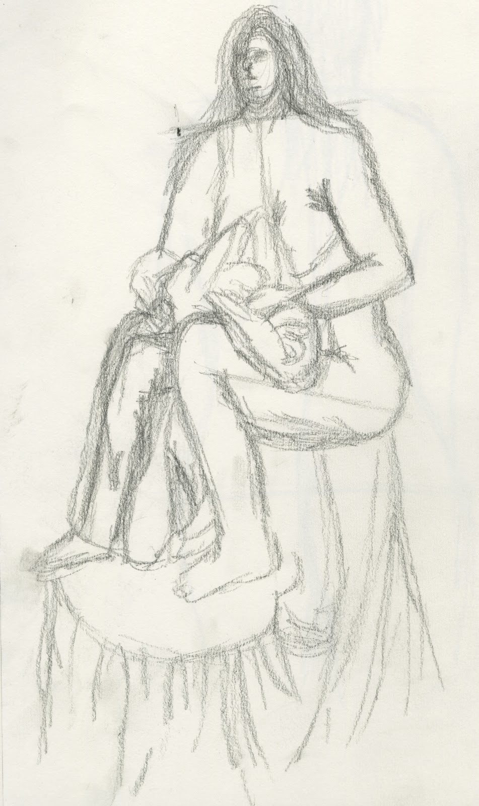
I am quite proud of this image, I feel that the drapery really gives you the feel of gravity pulling the material down. I like the way the fabric scrunches at the shoulder and hand, the shading on the bottom of the material shows how it folds and bends naturally.

The image of the model itself could be a lot better, but with the time which I had and subject of what I was aiming to achieve, I chose to focus more on the drapery itself.


This image is not one of my best pieces but I still like the way the cloth on the table drapes to the ground, especially around the edges of the table, you really get the sense of it being pulled and stretched almost. As with the image before the model is not a great image and the proportions are out by quite a lot, this is one of the hardest images I have had to draw, the detail in the fabric was mind boggling, I just couldn't seem to work out what was meant to go where.

The fabric itself was translucent, this is not shown very well in my image, other than the right leg you cannot see through any other part of the material, this was the hardest part for me and I know that I will need to practice this more for future projects.

Figure Drawing


These images really tested my drawing abilities not because of the difficulty but because of the time given for each pose. 1 minute is not enough time to get any technichal information down but it is enough time to get the basic human form.

I can see when looking back at these images the proportions are way out, this is because there is not enough time to messure and scale acordingly, this being said I believe with enough practice I will be able to get proportion pretty close to perfect.

Detail in Natural Forms, Refraction and Distortion


This image was my first attempt at any type of flower drawing, I chose pencil because I knew that I needed to get a lot of information onto the page to get the image across.

I like the way the shadows cast on the inside of the petals showing the defonition of the flower. I struggled drawing this image because of the amount of deatail required to show the flowers true form, that being said, the image still formed and I am quite happy with the outcome.

The shading on the flower at the botttom for me, is the worst part of the image. The different shades are too hard to distinguish, therefore making the image look messy and "overdone".


I struggled a lot on this image, the reflections from the water and the glass itself was too much for me to comprehend. I started by just drawing an outline of the bottle and went from there, drawing every reflection that I could see in the bottle, no matter how messy it became.

I really like the way the reflections are shown in this image by different shading strengths and techniques, you can really get the feel of it being a reflective material.

I tried to show too much detail on the bottle itself, trying to draw the writing which was on the bottle didn't work out how i expected as I couldn't really see in without getting closer and ruining my vantage point.


Classical Architecture


This is the image that I am most proud of or that I feel shows my best ability. At first I struggled to draw the different angles and perspectives in the image, but after a few thumb-nail sketches I finally got something I was happy with.

The flow of the image is its best quality, looking along the benches up to the pillar, around the arche and finishing with the doorway with the flowers infront. There is a lot of detail in this image and I believe that the shading works really well at showing the different lightings aswell as the difference in depth.

The one thing that I would change about this image is the shading, although I mentioned that the shading was good at showing the depths and shadows, it is also bad in the sence of the smudging. If i were to redraw this image I would not smudge the pencil, instead I would explore the different strengths of the pencils and try my shading like that.


Handling Complex Information


Back to charcoal. As I believed this to be the best medium for the task at hand, getting a vast amount of information onto the page is no easy task, therefore I thought that charcoal would get the amount of information needed to get a good final image.

The tower in the background is my favourite part of the image, I like the way the shadows are cast around the tower aswell as in the arches of the windows. The clouds on that day were perfect for drawing, the diffent lights and shadows cast on them was unbelievable, but as you can see, I didn't show this to my best ablility when getting it on paper.


Architectural Rendering: Post Modern Structures Continued


This is My first Pencil Drawing of the Atrium. I found that the pencil worked well for the quick sketching and outlining of the basic shapes needed to make the image but when it comes down to the shading it lacks something. If I had done the same image in charcoal, then I believe the end result would have been different.

I like the way the different strengths of shading show the difference in the light and dark areas, especially inside the atrium itself.

I didn't realise when drawing this piece but looking at it now i believe that the building behind the atrium looks a lot more rushed than the atrium itself, maybe if I had worked a little longer on this then the image would have looked a lot more complete.

Architectural Rendering: Post Modern Structures


This is my first drawing of the semester. I chose to start out with a charcoal drawing as the building was quite detailed but the time frame was limited, therefore I didn't want to be spending hours drawing this in pencil.

I like the way the shadows cast on the edges of the windows, it gives the image the feeling of depth and 3D rather than just being a 2D image.

I personally feel that the windows at the bottom of the page could have been a lot better had i used a different technique and created the illusion of reflections, like the reflections in the windows at the top of the image.